What’s Cheap? A Factor Perspective
There are a hundred ways to evaluate whether an investment is cheap--discounted cash flows, competitor multiples, mean reversion, multiple of projected earnings--the list goes on...and on. To each his own on what is the "best" valuation methodology, but suffice it to say that the persistent tug of our own behavioral biases suggests that objective measures (as opposed to subjective) are preferable.
While valuation is a terrible timing metric, its a pretty good mental model for helping understand what is driving the market. Felix Zulauf referred to this on a recent Masters in Business podcast as "knowing the zeitgeist of each market cycle". He thinks about it more thematically--suggesting that the current market cycle is all about China--while I think about it in terms of factors.
The logic would go something like this:
- Investors buy and sell stocks.
- The price per share that the stock transacts is an agreement between two parties as to what that stock is worth.
- That price per share continuously changes based on some combination of fundamentals and speculative sentiment.
- Think about "price" as the multiple paid for a dollar of sales, earnings, and/or cash flows.
- Draw inference from the trend in valuation over time.
For example, if I really wanted to by a high earnings growth company today, does it cost more or less relative to history? When measured using objective trailing fundamentals like sales, earnings, and cash flows, one can draw inference from the trend in valuation of a market segment. The market segment could be a market cap group, region, country, sector, industry, or factor. Our team has done exhaustive research of all these groups and find that the factor angle tends to be the most explanatory.
When I look at the current market relative to history, a few things stand out to me today.
Poor Quality is Expensive
The chart below looks at the cheapness of the best and worst stocks by earnings quality over the last three decades. Earnings quality measures cash-driven versus accrual-driven earnings. The vertical axis is a value percentile score; a lower score is cheaper. The orange line charts the valuation of stocks with poor earnings quality while the blue and grey dotted lines chart the same for strong earnings quality and large US stocks.

Key takeaway here is that poor earnings quality has been getting progressively more expensive since the credit crisis. There are two explanations for this. Valuation ratios have two components--price and a fundamental metric. For example, P/E has two components, a P and an E. If P/E is increasing and getting more expensive, P may be getting bigger because investor 's are buying, or the E is getting smaller, i.e. fundamentals are deteriorating. In the case of poor earnings quality, we can relatively easily eliminate the P getting bigger by looking at performance. From 2010 through 2017, poor earnings quality has underperformed the market by 2% annualized. The underlying fundamentals--sales, earnings, cash flows--of companies with poor earnings quality are deteriorating.
Below are the names with the poorest earnings quality rank in various sectors:
- Verizon (VZ)
- DowDuPont (DWDP)
- Paccar (PCAR)
- Tyson Foods (TSN)
- Abiomed (ABMD)
- DR Horton (DHI)
- Cheniere Energy (LNG)
- Nvidia (NVDA)
- CBRE (CBRE)
And just for fun, here are some other notable names falling in this poor earnings quality category:
- Apple (AAPL)
- Facebook (FB)
- General Electric (GE)
- United Parcel Service (UPS)
- Deere (DE)
Shifting from the quality of earnings to the quality of balance sheets, the story is a little bit different. The chart below looks at the valuation of financial strength, as measured by leverage and reliance on outside sources of capital, for the last three decades.

In 2017, strong balance sheets got more expensive and weak balance sheets got cheaper. Stocks with high financial strength were in favor, outperforming by 2.6% while poor financial strength underperformed by 2.1%. As the specter of rising rates has gradually picked up pace, this seems to reinforce that investors are preferring properly leveraged, as opposed to overly leveraged companies.
Earnings Growth and Momentum are en Vogue
As the current market cycle gets long in the tooth--few drawdowns, no recessions, and low volatility since the credit crisis--its pretty natural for investors to prefer strong earnings growth and momentum. I've done a bit of research on factor performance throughout the market cycle here. The chart below shows the valuation of the best and worst of earnings growth--a theme that includes profitability and year over year earnings change.

As with financial strength, we've seen a strong value reversion in the last year. Strong earnings growth outperformed weak by 7.5% in 2017. Investors are clearly favoring companies that are logging strong earnings gains, and shunning those with questionable current growth prospects.
Momentum and earnings growth tend to have a symbiotic relationship. Fundamental growth in earnings begets investor interest as we tend to extrapolate previous growth on into the future. Investor interest leads to flows into a stock or sector, which drives prices up (i.e. momentum). The cocktail of earnings increases and momentum is a potent combination that drives further interest and return chasing--sometimes warranted, sometimes not.

Momentum tends to be a shorter term signal than the other factors discussed. The scenario I just described tends to lead to a lot of rotation within the factor as market leadership changes. For example, in 2014 the Energy sector went from darling to delinquent in a short 6-month period as oil prices crashed. Sentiment changes fast sometimes. From a position of valuation parity in early 2015, high momentum has become more expensive while weak momentum has gotten cheaper. This is mostly driven by investor preference for strong momentum in 2015 and 2017. In 2017, strong outperformed weak momentum by 11%--a huge margin.
Shareholder Yield Gets Cheaper
Finally, we look at shareholder yield, a measure of total return of capital to shareholders through buybacks and dividends. This is probably the most controversial factor because of all the bad press buybacks get.
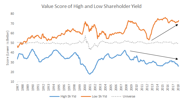
Stocks with the best shareholder yield have been getting consistently cheaper since 2008. On the flip side of the equation, companies that tend to dilute their shareholders are about as expensive as they’ve been over the last three decades.
Summing it up at this late stage in our bull market:
- Companies with poor quality earnings appear to have some deteriorating fundamentals.
- Investors are bidding up the prices of stocks with strong balance sheets.
- Favoritism for high earnings growth and strong momentum is in-line with historical trends in later stages of bull markets.
- Stocks with high conviction buyback programs are as cheap as they’ve been since the tech bubble, and trending cheaper.